


Tino's Jersey Reviews: Los Angeles Chargers
Hello everyone! Welcome to Tino’s Jersey Reviews!
In the last review, we saw the New England Patriots switch things up a bit in the new era without Tom Brady. If you skipped past that one, go check it out now! In this review we are staying in the American Football Conference (AFC) and looking at another team approaching a new era, a new era without longtime quarterback Phillip Rivers that is. Let’s review the Los Angeles Chargers.
First thoughts- The Chargers have won the 2020 National Football League (NFL) offseason. No matter what happens from here on out, the Chargers have released the best uniforms so far, and with only the Rams remaining, it is most likely going to stay that way. There are six (possibly more) uniform combinations right off the bat, and don’t even get me started on those yellow pants (I’d marry those pants if I could). But not only that, the Chargers are the only team in the NFL to have numbers on their helmets.
The Chargers have always had good uniforms, if not the best. But these have taken it to the next level. When you think about iconic uniforms in all of sports, you think about The New York Yankees, Los Angeles Lakers, Boston Celtics and the Alabama Crimson Tide. Well, these new uniforms the Chargers will be wearing for the 2020 NFL season top every single one of those uniforms. These are the best uniforms worn by any team, in any time, ever. They may not be the most iconic, which is fair because they don’t have the hardware to battle with the Yankees or Celtics, but they are the best.
I was unsure if they would bring back the yellow pants, as we haven’t seen them since 1979. It just screams classic greatness at you. Not only did they bring the pants back, but look at the details – you can see the lightning bolt down the side of it matches with the one on the shoulder pads and the helmet. The Chargers have found a way to make something so simple, so neat and smooth. Getting rid of the white background under the lightning bolt, whether it was on the pants or the jersey itself, really helped the logo take on a more defined shape.
Getting “rid” of the navy that was mixed in with the powder blue and the Bolt was an amazing choice; I put quotes around that because they didn’t necessary get rid of it altogether. Not only does it look much better without the contrast of blues mixed into one logo on the jersey, but they were able to preserve some of their heritage by making one of their color rush/alternate uniforms an all-navy look. That one is just incredible, one of my personal favorite options out of the six, and the powder blues are still fantastic too. Especially for a casual wear as a fan – if I’m a Chargers fan, I’m getting that navy one and never taking it off.
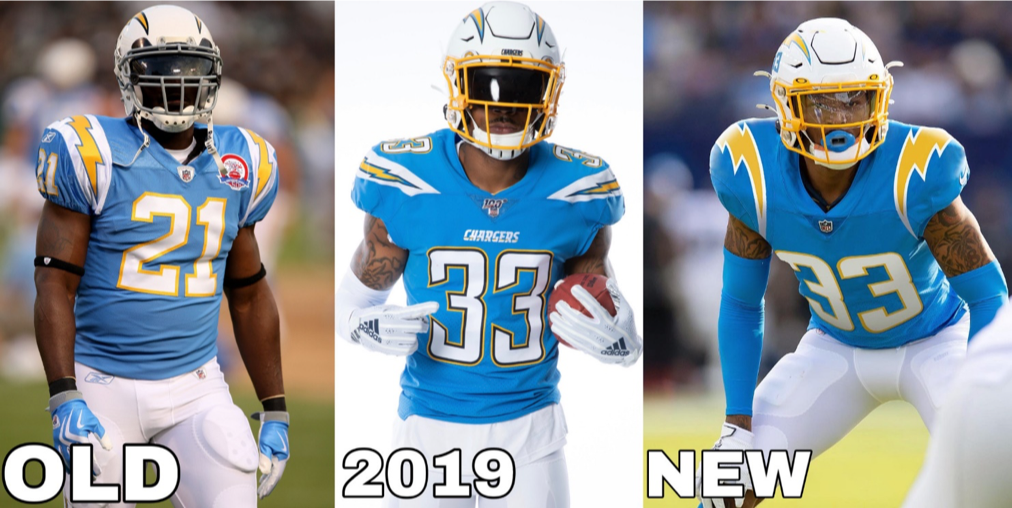
The Chargers powder blue look has stood the test of time. After making their powder blue alternates their official home look for last year, we knew it was time to keep it that way. Chargers Defensive Back Derwin James posted a picture on his social media accounts with him edited in the new looks, you can see how the minor changes over time have definitely made major improvements.
But I will say this, they are missing one thing. You’re probably thinking, “Tino, you just said these were the greatest things ever created!” This is true, but they are not perfect. Look above at the picture from 2019. You can see it says “Chargers” on the jersey, right in the middle above the numbers. Even though the one to the left of that with LaDainian Tomlinson in it is older, it has a patch on the left side which takes up empty space. Now when you look back at the new 2020 version, you can see it is missing something. It has too much empty space from the numbers to the neckline. If the wordmark of “Chargers” was there, these would be absolutely perfect. I know that is a very minor detail, and one you probably didn’t notice. But that is why I am Tino, writer of Tino’s Jersey Reviews.
The presentation of these uniforms was almost as good as the uniforms themselves. The uniform reveal video posted across the Chargers social media platforms was amazing. It starts out by giving looks at old uniforms with yellow pants, then navy, followed by powder blue. Then, the voiceover says, “First you start with the design process ... nah who cares? All you need to know is we took the best and made them better.” That makes me feel even more confident these uniforms are the best, and every team in the NFL needs to take notes.
The Chargers did something that needs to be understood by everyone. They needed to make new uniforms, but in doing so they incorporated a new design (the bolt) and they paired that with things that had worked before (the pants, the style). The perfect combination of past and future to create the present.
Chargers running back Austin Ekeler posted this picture of his new helmet for the upcoming season to his Instagram. The Chargers are the only team so far this offseason to make major changes to their helmets (The Rams released a new logo but not a helmet, yet). What they did is amazing; the powder blue numbers with the yellow bolt which matches the facemask just makes the whole uniform look great. You rarely have an NFL team that looks good from head to toe. But I am not the only one who approves of this change. A CBS8 San Francisco article compiled some of the best opinions. Here are what some of the players in LA had to say:
Chargers Legend Antonio Cromartie
"We're always going to have the sweetest uniforms no matter what."
"This right here is my favorite cause you got the old uniform mixed in with the new."
RB Austin Ekeler
"The thing that stands out to me the most is the new Chargers emblem."
"It almost looks like a throwback."
CB Chris Harris Jr.
"We have the most unique jerseys. Definitely swag with it. A+ for sure!"
CB Casey Hayward
"That baby blue on white hard! ooooooooooooo."
"Whoever came up with it, you get two thumbs up from me."
Honestly, all things considered I can’t figure out what my favorite combination is out of the six. The primary home with the powder blue and yellow pants blows me away, but then the all-white away option is cool as it’s almost like a new throwback. I can’t just not say anything about the all-blues! Those were their color rush from last year and I’m happy they brought them back and added the new style.
What is your favorite combination of the six shown? Would you like to have seen something different? Maybe a navy blue jersey with blue pants? Let me know in the comments section.
Okay, okay enough of the electric talk. Let’s get on to the review.
Six brand new looks, numbers on the helmet, those amazing yellow pants, old mixed into the new ...
Tino’s rating: 9.7
Boom! The highest rating ever on TJR, and they deserve it. These are so nice; I don’t just want to buy the jersey itself – I want the whole uniform! They couldn’t get a 10/10 due to the wordmark issue, but no one has been perfect in the NFL, and these are by far the closest to that. I usually try to find a way to roast the team somehow in this part, but I don’t think I can after a review like this. I mean, to have the nicest jerseys out of the whole league and not go above .500 for next year is a roast in itself!
Photos Courtesy of the Los Angeles Chargers

